

During my work as a frontend developer often enough I had to face a task of table creation. Tables needed to contain specific functionalities, starting from sorting and filtering, through pagination and infinite scroll, ending with pinned columns and rows. These tasks are rather common so it is natural to create a reusable library. A problem appeared with more requirements, as for example fluid column resizing or moving rows by a user. In these cases extending the library with new functionalities would require a lot of development time. Luckily, we don’t need to reinvent the wheel – one library which offers listed functionalities exists and its name is ag-grid. I would like to introduce you with it by creating an application using Angular framework.
About the library
Let’s start with a bunch of facts about ag-grid:
- supports two newest desktop browsers versions: Chrome, Firefox, Microsoft Edge, Safari and Internet Explorer 11. For mobile there are only two browsers supported: Chrome and Safari iOS, both for two newest versions,
- its implementation doesn’t constrain us to a specific framework. We can use an API adjusted to vanilla JavaScript or popular libraries and frameworks: Angular, AngularJS, Polymer, React or Vue,
- it is available in two options: community (free) and enterprise (paid) which gives more functionalities. Comparison of options’ differences you can find here). One remark regarding paid version – if you want to use it in production, you need to buy two licences – one for a developer and another one for the production environment,
- besides documentation, there is an official blog conducted where you can find articles about what this library offers.
Installation in Angular project
We need two dependencies. We install them using the command:
npm install --save-dev ag-grid-community ag-grid-angular
Subsequently, we have to import a library module to our project. We do this in app.module.ts
// other imports
import { AgGridModule } from 'ag-grid-angular';

@NgModule({
  // other fields
  imports: [
    // other modules
    AgGridModule
  ]
})
export class AppModule { }
In the end, we need to add some CSS styles in styles.scss file
@import "~ag-grid-community/dist/styles/ag-grid.css"; /* obligatory one */
@import "~ag-grid-community/dist/styles/ag-theme-balham.css"; /* one of theme styles */
In case of a need for changing chosen theme CSS styles, we can overwrite them. I suggest to create another file (in my project ag-grid-override.scss) and import it along with ag-grid styles.
Project preparation
A project which we will develop is a table of books. We need columns and rows to create the table. TableService will be responsible for fetching our component with data:
@Injectable()
export class TableService {
  getHeaders(): Observable<gridheader[]> {
    return of(headers);
  }

  getList(): Observable<book[]> {
    return of(books);
  }
}
</book[]></gridheader[]>
headers and books objects are imported from separate files. The first one will be changed together with project development, so its structure will be presented on an ongoing basis. The second structure is:
// book.interface.ts

export interface Book {
  name: string;
  author: string;
  genre: string;
  pages: number;
}
We add TableService to AppComponent‘s providers list.
Basic functionalities
We want to create the table with the following functionalities:
- column order change by a user,
- column width change by a user,
- sorting in specific columns,
- filtering in specific columns,
- moving rows animation,
- pinning specific columns.
These functionalities we will implement step by step.
Table creation with a determined number of columns
In the beginning, we would like to display the table. To do it, our AppComponent must take headers and rows and share these data with the component from ag-grid library. Our class is as follows:
@Component({
  selector: 'app-root',
  template: `
    <ag-grid-angular
      class="ag-theme-balham grid"
      [rowData]="rows$ | async"
      [columnDefs]="headers$ | async">
    </ag-grid-angular>
  `,
  styles: [`
    .grid {
      width: 1800px;
      height: 300px;
    }
  `],
  providers: [TableService]
})
export class AppComponent implements OnInit {
  headers$: Observable<GridHeader[]>;
  rows$: Observable<Book[]>;

  constructor(private tableService: TableService) {}

  ngOnInit() {
    this.headers$ = this.tableService.getHeaders();
    this.rows$ = this.tableService.getList();
  }
}
We call ag-grid-angular component in a template and provide two inputs to it using async pipe. The first one, columnDefs, takes headers on the basis of which creates columns. The second one takes data for rows creation. headers structure is as follows:
// grid-header.interface.ts

export interface GridHeader {
  headerName: string;
  field: 'name' | 'author' | 'genre' | 'pages';
}
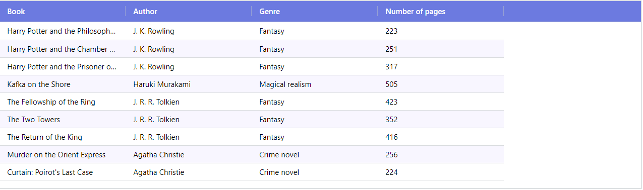
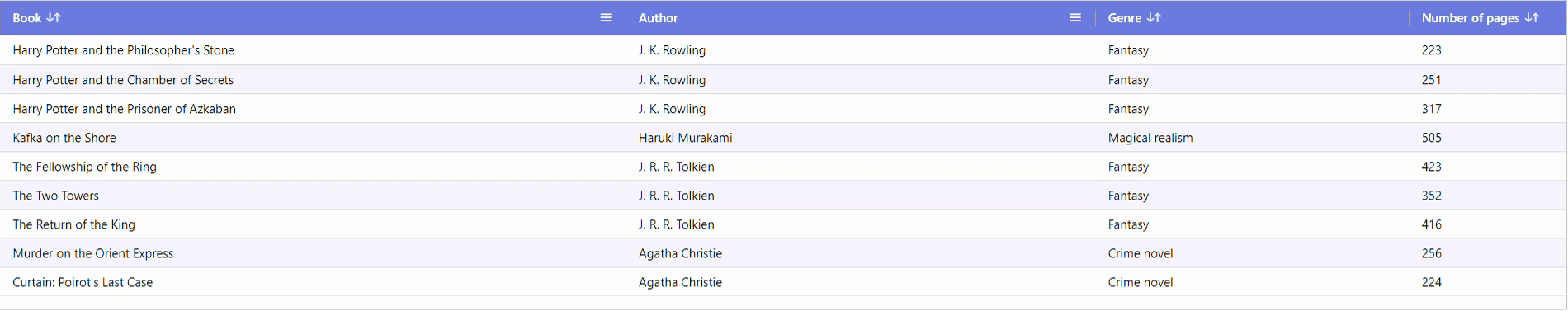
It is crucial to have values in field attribute the same as Book interface attributes. On their basis table cells are filled in proper order. Possibility to change column order by the user is offered out of the box. The basic view is presented in the following picture:
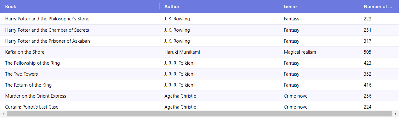
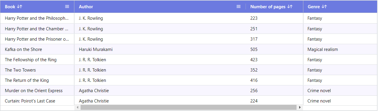
If we want columns to adjust their width to table width or share equally with possible space, we can add flex: {number} field to headers elements. The number means how many width units should be taken for a specific column. We can also give a chance for the user to change column size by setting resizable field to true. headers object containing flexible column width with ratio 4/3/2/1 looks as follows:
// headers.ts

export const headers: GridHeader[] = [
  {
    headerName: 'Book',
    field: 'name',
    flex: 4
  },
  {
    headerName: 'Author',
    field: 'author',
    flex: 3
  },
  {
    headerName: 'Genre',
    field: 'genre',
    flex: 2
  },
  {
    headerName: 'Number of pages',
    field: 'pages',
    flex: 1
  }
];
A picture below represents a view for this column configuration:
Sorting in specific columns
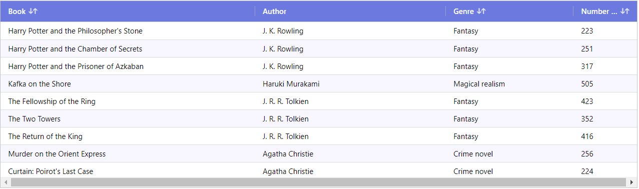
Sorting rows based on specific column values is dead easy when we use ag-grid. The only thing we need to do is to add sortable field to headers element and set it to true. There is no icon showing unsorted order by default. We can change it by adding unSortIcon field and setting it to true. headers structure looks as follows:
// grid-header.interface.ts

export interface GridHeader {
  headerName: string;
  field: 'name' | 'author' | 'genre' | 'pages';
  flex: number;
  sortable: boolean;
  unSortIcon: boolean;
}
The table with sorting option is shown in a picture below:
Filtering in specific columns
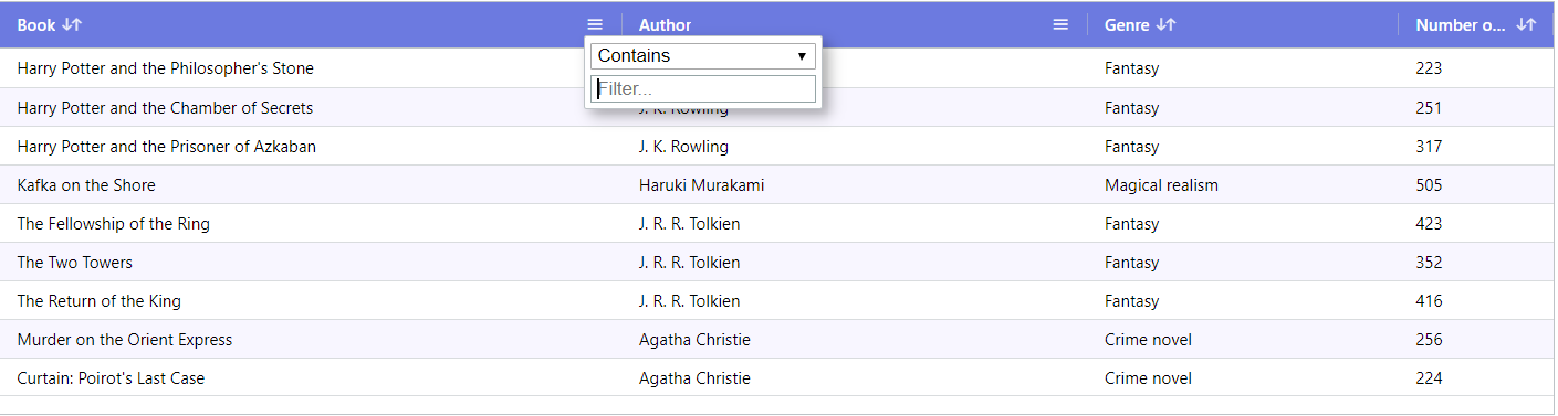
Filtering is as easy as sorting. The only thing we need to do is to add a filter field with true value. By default, the filter icon appears only when the user hovers over the column header. We can change it too by doing two things
- add suppressMenu field with value false set to it,
- overwrite default table configuration by adding configuration object to the component.
Let’s create an object in AppComponent:
  gridOptions = {
    suppressMenuHide: true,
  };
and modify the template a bit by adding one input
[gridOptions]="gridOptions"
Due to this, the filtering icon will always be visible as you can see on a picture below:
Row animation
Until now, when the user clicked sorting or changed filtering value, rows disappeared or appeared without any animation. If we want to add some life to the table, we just have to add another input: animateRows with the value set to true. Our template looks like this:
@Component({
  template: `
    <ag-grid-angular
      class="ag-theme-balham grid"
      [columnDefs]="headers$ | async"
      [rowData]="rows$ | async"
      [gridOptions]="gridOptions"
      [animateRows]="true">
    </ag-grid-angular>
  `,
})
The result you can see on a gif below:
Pinned columns to left/right
To pin table column to the left or right-hand side, we add pinned field with value left or right to object describing specific column. If there is any pinned column, there also appears pinned columns section where user can move other columns to this section making them also pinned. We can restrict pinned column to be movable only within this section – the same we can do with not pinned ones making them movable only within the not pinned section. This is done by adding lockPinned field with the value set to true. headers structure extended by these two fields is as follows:
// grid-header.interface.ts

export interface GridHeader {
  headerName: string;
  field: 'name' | 'author' | 'genre' | 'pages';
  flex: number;
  sortable: boolean;
  unSortIcon: boolean;
  pinned?: 'left' | 'right';
  lockPinned?: boolean;
}
The table with pinned columns is shown on a picture below:
Summary
If we use ag-grid, table creation with basic functionalities is really easy. By writing a few lines of code we can enable sorting, filtering, column pinning. We can save a lot of hours. The library offers us many more functionalities, for example, infinite-scroll, custom components as input filter window, custom components inside table cells or inline editing.
In my opinion, it is worth getting to know ag-grid! Repository with full code described in this article you can find here.