
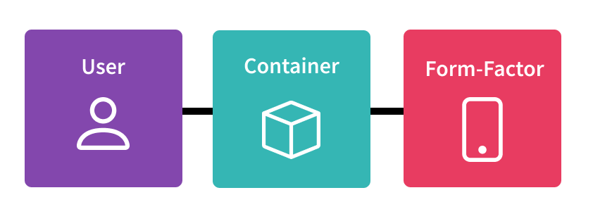
Why is responsive design so important?
Using responsive design is critical for creating websites and applications that are accessible, inclusive, and user-friendly, regardless of a user’s abilities or preferences.
However, the first step towards creating a website that fulfills the preference of most users begins with getting a thorough understanding of users’ needs and preferences. For this, designers and developers use techniques such as user testing, user research, and user personas. They also use technologies such as CSS variables, JavaScript, and server-side rendering to dynamically adjust the user interface based on the user’s settings and preferences.
Also, by providing options and settings that allow users to customize their experience, designers and developers create more inclusive and user-friendly websites and applications. For example, users with visual impairments may prefer larger font size or high-contrast color scheme, while users with hearing impairments may prefer closed captions or transcripts for video and audio content.
Responsive design using media query and CSS
Media query and container query are important features of responsive design. They allow content rendering and adjusting the layout and styling of a website.
Media query
Media query is a well-established technique in responsive design and has been widely used for many years. This feature allows designers to adjust the layout and styling of a website based on the screen size and resolution of the device, and is supported by most modern browsers. Here are some pros and cons of this feature.
Pros:
- Flexibility: Allows developers to create layouts that adapt to a wide range of screen sizes and resolutions, making it possible to provide a great user experience on desktops, laptops, tablets, and smartphones.
- Better performance: By delivering different styles and content based on screen size, websites can reduce the amount of data that needs to be downloaded, resulting in faster load times and better performance.
- Improved SEO: Improve search engine rankings and make it easier for users to find and access content on any website, especially on mobile devices.
- Future-proofing: Developers can ensure that their sites will continue to work well on new devices with different screen sizes and resolutions in the future.
Cons:
- Complexity: Makes the development process more complex, requiring additional code and testing to ensure that the layout works well on different devices and screen sizes.
- Additional work: Requires more work and time than creating a fixed-width design, especially if the design needs to be modified for a wide range of screen sizes.
- Overcomplication: Overuse of media queries can lead to code bloat, resulting in slower page load times which can have a negative effect on a website’s performance.
- Lack of browser support: Older browsers may not support media queries, which can result in poor user experience on those browsers. However, as older browsers are being replaced by newer ones, the scope for this problem is decreasing.
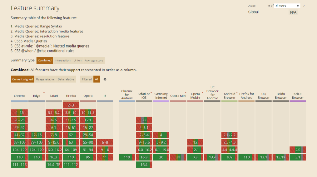
Source: https://caniuse.com/
Container query
This is a newer technique that allow designers to adjust the layout and styling of a website based on the size of the container element instead of the screen size. This allows for more precise and targeted styling, and can be particularly useful in complex layouts where different elements need to be adjusted independently.
Pros:
- Increased modularity: Makes it easier to create modular, reusable styles that are tailored to specific elements on a page, instead of relying on fixed breakpoints based on the viewport size.
- Greater precision: Developers can create styles that respond to the size of a specific element instead of the entire viewport, providing greater precision and control over the layout.
- Improved efficiency: Help reduce the amount of code needed to create responsive layouts by allowing developers to write more targeted and reusable styles.
- Better scalability: Makes it easier to create scalable designs that can adapt to different screen sizes and resolutions without requiring extensive testing and modification.
Cons:
- Limited browser support: Not all browsers support this feature, so developers must use fallback strategies, such as media queries or JavaScript, to ensure that their designs work well on all devices.
- Increased complexity: Makes the development process more complex, requiring additional code and testing to ensure that the layout works well on different devices and screen sizes.
- Overcomplication: Overusing this feature can lead to code bloat, resulting in slower page load times which can negatively affect a website’s performance.
- Possible performance issues: Depending on how they are implemented, container queries can potentially introduce performance issues, such as increased memory usage or slower page rendering, although these issues are not unique to this feature and can be mitigated with good coding practices.
This article was contributed by Nina Dakowicz, Technical Leader, DCIG.