
Types of responsive layout patterns
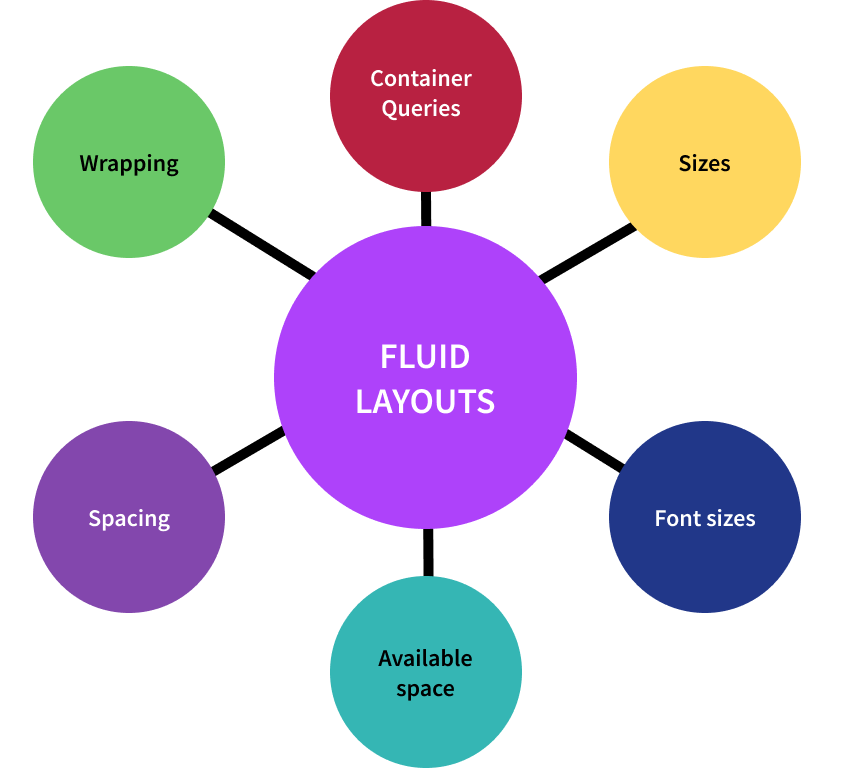
Fluid layout
This type of web design pattern uses relative units, such as percentages, instead of fixed units, such as pixels, to define the size and position of page elements. This allows the layout to adjust and adapt to different screen sizes and resolutions, creating a more flexible and adaptive design.
With fluid layout, the size and position of page elements are defined as proportions of the total screen width or height, instead of specific pixel values. For example, a fluid layout might define the width of a page element as ‘50%’, which means, it will always take up 50% of the screen width, irrespective of the screen size or resolution.
Fluid layouts are an important component of responsive design, as they allow websites to adapt to different screen sizes and resolutions, from desktops to mobile devices. By using relative units, designers can create layouts that are flexible and adaptive to provide better user experience across devices.
However, creating fluid layouts requires careful planning and testing to ensure that the designs remain visually appealing and functional across different screen sizes and resolutions. In some cases, designers may need to use additional features, such as media queries or flexbox, to create more complex and adaptive layouts.
Fixed layout
This is an alternative to fluid layout. With fixed layout, the size and position of page elements are defined using fixed units, such as pixels instead of relative units. This means that the layout remains the same size and shape regardless of the screen size or resolution.
Fixed layouts can be useful in cases where precise control over the layout is needed, or when designing for a specific screen size or device. However, they can create challenges when designing for a range of different devices and screen sizes, as the layout may not adapt well to all of them.
Hybrid layout
This approach combines both fixed and fluid elements in the design. This allows designers to create a layout that is both precise and flexible, and can work well across a range of screen sizes and resolutions.
Ultimately, the choice of layout depends on the specific needs and requirements of the project, as well as the design goals and target devices. In many cases, a combination of fluid and fixed elements may provide the best balance between control and flexibility in the layout.
Responsive design vs adaptive design
Responsive design and adaptive design are two approaches to creating websites that can adapt to different screen sizes and resolutions, but they differ in their implementation.
Responsive design is based on fluid grids that use relative measurements, such as percentages, to adapt to the size of the screen. This means that the layout of the website changes dynamically as the screen size changes, with the content and images resizing and repositioning to fit the available space.
Adaptive design, on the other hand, uses a predefined set of layouts and styles that are specifically designed for different screen sizes. Instead of using fluid grids, adaptive design relies on fixed-width layouts that are optimized for specific devices or screen resolutions. Adaptive design typically uses server-side detection to determine the user’s device and then serves the appropriate layout and styles.
Here are some key differences between responsive and adaptive design:
- Flexibility: Responsive design is more flexible than adaptive design, as it can adapt to a wider range of screen sizes and resolutions, whereas adaptive design is limited by the number of predefined layouts.
- User experience: Responsive design provides a more consistent user experience across devices, as the layout and content adapt to the available screen space. Using adaptive design can result in a disjointed experience when users switch between different layouts.
- Development time: Developing a responsive design takes longer than adaptive design, as it requires more testing and tweaking to ensure that the layout works well on a wide range of devices and screen sizes.
Overall, both responsive and adaptive design have their strengths and weaknesses, and the choice between them depends on the specific needs and goals of the website or application.