
What is responsive design?
Responsive design is an approach used for creating websites that can adapt and provide an optimal viewing experience across devices with varying screen size. The goal is to ensure that websites are easy to read and navigate, regardless of whether they are being viewed on a desktop, tablet, or mobile phone.
Responsive design typically involves using flexible grids and layouts, images and media that can scale up or down depending on the screen size of the device. CSS media queries are used to adjust the styling of the elements. Websites using responsive design techniques provide a seamless user experience and help ensure easy access and interaction with the content, irrespective of the viewing device.
Using responsive design is important for several reasons:
- Improved user experience: With more and more people accessing websites on a variety of devices, responsive design ensures that a website looks and functions well on all devices, providing an optimal user experience.
- Increased accessibility: Since websites created using Responsive design support various devices, they are also accessible to people with disabilities, who may use different assistive technologies to browse the web.
- Higher search engine rankings: Search engines like Google give preference to mobile-friendly websites in their search results. By using responsive design, websites can improve their search engine rankings and attract more traffic.
- Cost-effective: Responsive design eliminates the need for creating multiple versions of the same website for different devices. This saves time and money during development and maintenance.
- Future-proofing: As new devices with different screen sizes and resolutions are released, using responsive design ensures that a website will continue to work well on every device without requiring a major overhaul.
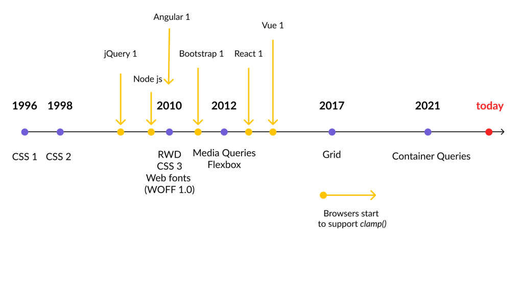
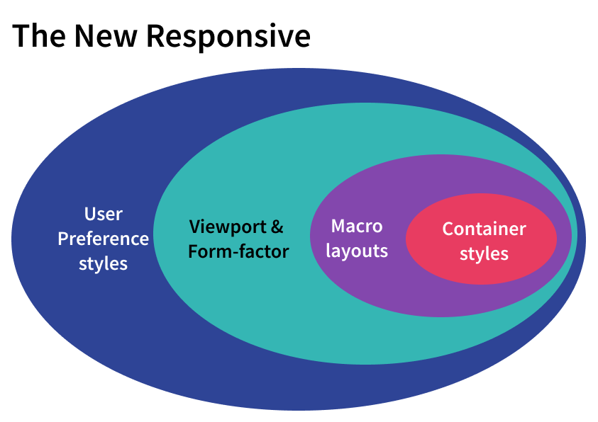
Evolution of responsive design
Responsive design has evolved significantly over the years due to the rapid advancement of technology and changes in user behavior. Here are some ways responsive design has changed:
- Mobile-first approach: With most internet users now browsing the web on mobile devices, many designers and developers have shifted to a mobile-first approach. This means designing for the smallest screen size first and then scaling up for larger screens.
- More emphasis on performance: As websites become more complex, performance optimization has become a key consideration in responsive design. This includes using techniques like lazy loading, minification of code, and image optimization to reduce page load times.
- Greater use of responsive frameworks: Developers are increasingly using pre-built components and layouts like Bootstrap and Foundation. These can be customized for specific needs.
- Increased use of CSS Grid: This powerful tool has gained popularity for creating responsive layouts that can adapt to different screen sizes and aspect ratios.
- Emergence of new technologies: To provide better user experience on mobile devices, responsive design has adapted to incorporate technologies like Progressive Web Apps (PWAs) and Accelerated Mobile Pages (AMP).
- Responsive images: These are images that are optimized for different screen sizes and resolutions. So, they load quickly and look good on all devices. Techniques like lazy loading and art direction can help ensure that images are resized and cropped to fit the available space, and loaded only when needed.
- Responsive typography: This involves using techniques like fluid type and modular scales to ensure that the text is legible and readable on all devices. This can involve adjusting the font size, line height, and line length based on the screen size and resolution.
- Responsive animation: Creating animations that are optimized for different devices and screen sizes is achieved through responsive animation with technologies like CSS animations and transitions, as well as JavaScript libraries like GreenSock and Anime.js.
- Responsive email design: This involves creating emails that are optimized for different email clients and devices, so that they are readable and functional on all platforms. This involves using techniques like media queries, fluid layouts, and optimized images and fonts.
Responsive design continues to evolve and expand into new fields and technologies, as designers and developers seek to create websites and applications that work well on all devices and platforms.